Yeah! I was also thinking of that in my last post, but forgot to mention:p
Here are some samples with the changes. I’m also working on a few other changes…
- New permit icons since the location isn’t actually a supercharger yet. Please voice if you’re against a new permit icon or if you have any suggestions
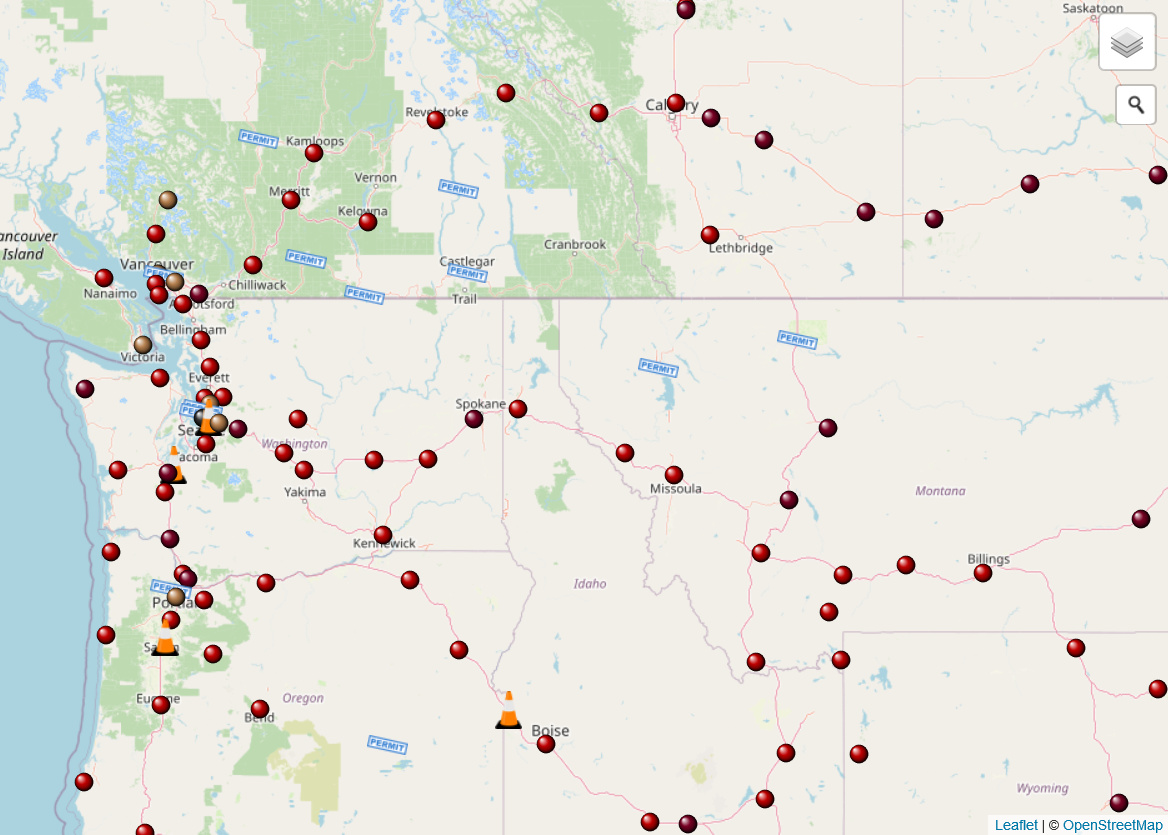
- Higher resolution icons to scale well on high-definition displays. I’ve converted all the remaining 50/50 dots to SVG and will see if I can do it for the construction cone
Yellow - Urban, Pink - V3 (also a smaller cone)
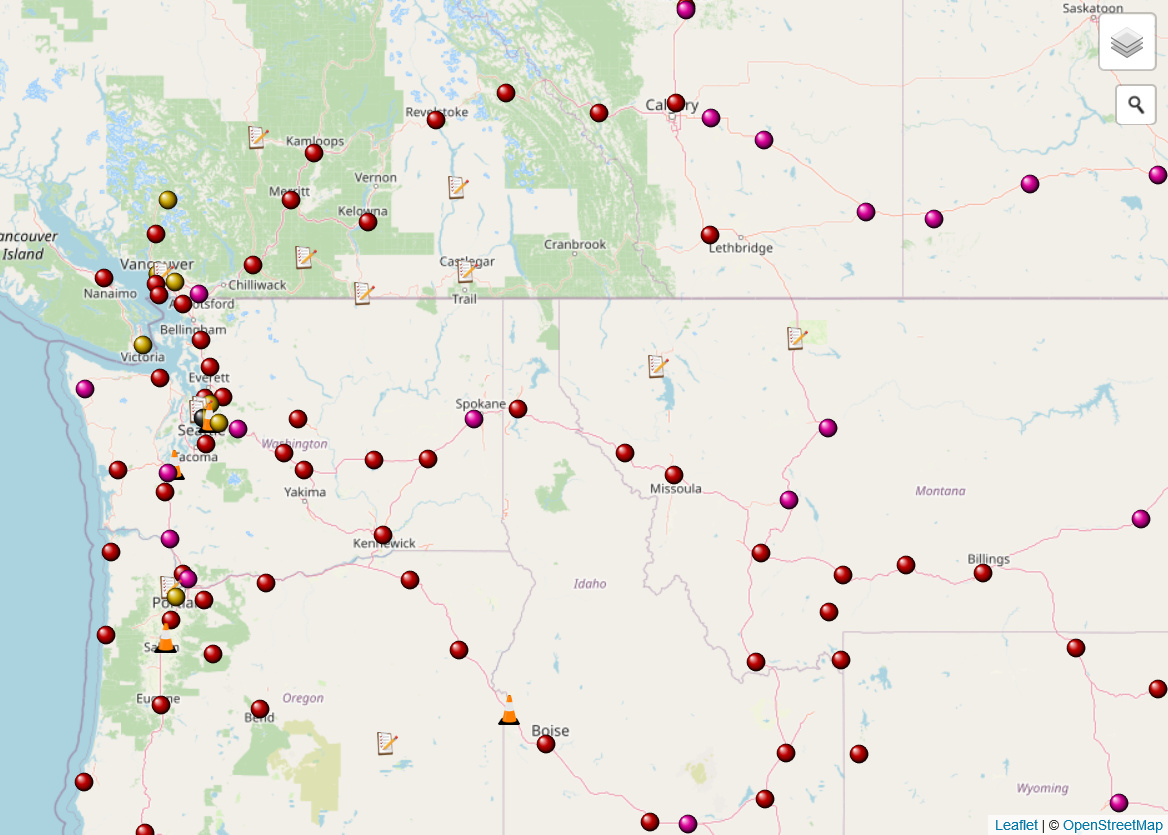
Brown - Urban, Burgundy - V3
Personally I feel that any brown and any dark color doesn’t have enough color which is useful for telling the dots apart, so I prefer the first image for the dots. I also prefer the stamp icon over the clipboard for permits since it matches the color scheme and stands out more. Let me know what your opinions are.
1 Like
@Pluto I like the yellow/pink varieties, and also the clipboard better. The permit icon looks nice but I prefer the icons that are circular/square-ish, as it helps prevent the map from looking too crowded when there are a lot in a small area. Good call on shrinking the cone icon too.
I agree with @chuq that I’d be happy to see this on supercharge.info as long as there is a way to toggle the various colors on and off. It’s useful to be able to differentiate the capabilities, but it can get a bit busy to the eyes. And, when planning road trips I don’t usually care too much about the Supercharger’s capability, as long as there is a dot that isn’t blue then I’m happy. 
Great work @Pluto!
I agree with the change to the permit icon. It makes sense that if colours are to be used to denote different speeds, that permit and construction be marked with symbols that are not just coloured dots - they should vary by something else.
I agree with @corywright that maybe something more abstract. Maybe the construction cone as well. Make it something simple like a triangle with orange/white stripes, and then have the permit be a greyscale version of the same. (or perhaps - a plain white triangle for permit, then add the orange stripes when it becomes construction?)
Something like this, except don’t use my particular images because I’m not a graphic designer and they look bad, but I’m sure someone with the talent can take this ideal and make it 1000% better by changing the triangle shape, or angle or thickness of the stripes, etc.
Notably Plugshare and OpenChargeMap both use the same colour scheme, which includes orange for DC fast chargers which are mostly 50 kW, so maybe orange could be used for the 72 kW urban chargers. I’ve suggested to both that they use a differing colour for ultra-rapid (175-350 kW) stations so maybe if they ever do that then supercharge.info could agree to align colours in some way? Noting of course that they steps are different (50 / 175 / 350 for most public ones vs 72 / 120-150 / 250 for superchargers).
[Edit: Missed the obvious flaw here that orange for the urban SCs may be confused with the orange for the construction cones]
I like this line of thinking, it’s simple and consistent. Maybe just a simple orange triangle for construction, and a simple blue square for permit?
Nice work @Pluto. Of the two I also prefer the yellow-red-pink scheme and agree with @corywright that if this is implemented it should be done as an option the user can select.
Also, as a minor adjustment, how would people feel about changing the title of the “permit” category to “in development” or just “development”. A lot of the time, sites are discovered from planning/zoning applications (or other sources knowledgeable about them), and these are technically happening before the project reaches the stage where it has or is applying for permits. Sometimes long before. It’s not a very big deal, but when discussing sites with people who aren’t familiar with the development process the fact that SC.info uses “permit” for known sites that are in any stage of development, regardless of whether they actually have permits or not, occasionally causes some confusion.
The only thing that makes me prefer a triangle is just for simplicity. Once there are squares, triangles, circles, it’s not entirely clear to a newcomer to the site. I only suggest triangle because of the visual link to the current construction cone icon. A permit is kinda like a pre-construction site?
Then it’s simple:
- Triangle - not built (colour indicates stage)
- Dot - built (colour indicates speed).
I’ll see if I can come up with some different (simpler) icons to get feedback on. I was poking around with SVG’s last night and I feel like I might be able to come up with some high quality icons for triangles. Here’s what I did for the construction cone for instance (original on right when zoomed in that much):


Obviously starting with something complete makes it easy to make small adjustments, so in case this is an option, here’s an example that’s blue (presumably for permits):

4 Likes
Just as a comparison, I thought I’d look at the existing images for dots. I note they are 16x16 pngs, full frame circles with gradient interiors. I did the same for a triangle and came up with the following in orange, grey and blue:
![]()
![]()
![]()
1 Like
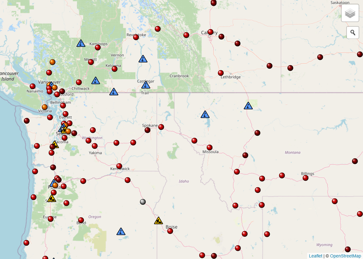
Here’s the map with triangles for permit and construction (I suppose custom markers and maybe permanently closed and temporarily closed sites should be redone as triangles if this is the path we go with). I also brightened up the yellow dots slightly:

I definitely love the idea of triangles after seeing it on the map. Here’s an example with slightly larger/taller icons (from an equilateral 16x14 to isosceles 18x17):

Let me know of any suggestions and I can provide more comparisons/adjustments. Anyways, here are a majority of the icons I’ve come up with if anyone wants to use/modify what I’ve created:
<!-- Construction Triangle -->
<?xml version="1.0" encoding="UTF-8" standalone="no"?>
<!DOCTYPE svg PUBLIC "-//W3C//DTD SVG 1.1//EN" "http://www.w3.org/Graphics/SVG/1.1/DTD/svg11.dtd">
<svg xmlns="http://www.w3.org/2000/svg" version="1.1" width="16" height="14">
 <defs>
  <radialGradient id="Shiny"
    cx="0.5" cy="0.65" r="0.5" fx="0.4" fy="0.5">
   <stop offset="0%" stop-color="#ffffff" />
   <stop offset="37%" stop-color="#ff7f00" />
   <stop offset="87%" stop-color="#994400" />
   <stop offset="100%" stop-color="#000000" />
  </radialGradient>
 </defs>
 <path fill="url(#Shiny)" d="M 0 14 L 8 0.14 L 16 14 Z" stroke="#000000" stroke-width="1" />
</svg>

<!-- Permit Triangle -->
<?xml version="1.0" encoding="UTF-8" standalone="no"?>
<!DOCTYPE svg PUBLIC "-//W3C//DTD SVG 1.1//EN" "http://www.w3.org/Graphics/SVG/1.1/DTD/svg11.dtd">
<svg xmlns="http://www.w3.org/2000/svg" version="1.1" width="16" height="14">
 <defs>
  <radialGradient id="Shiny"
    cx="0.5" cy="0.65" r="0.5" fx="0.4" fy="0.5">
   <stop offset="0%" stop-color="#ffffff" />
   <stop offset="37%" stop-color="#3366cc" />
   <stop offset="87%" stop-color="#003399" />
   <stop offset="100%" stop-color="#000000" />
  </radialGradient>
 </defs>
 <path fill="url(#Shiny)" d="M 0 14 L 8 0.14 L 16 14 Z" stroke="#000000" stroke-width="1" />
</svg>

<!-- Construction Cone -->
<?xml version="1.0" standalone="yes"?>
<!DOCTYPE svg PUBLIC "-//W3C//DTD SVG 20010904//EN"
"http://www.w3.org/TR/2001/REC-SVG-20010904/DTD/svg10.dtd">
<svg version="1.1" width="22" height="30"
  xmlns="http://www.w3.org/2000/svg"
  xmlns:xlink="http://www.w3.org/1999/xlink">
 <defs>
  <radialGradient id="tip" cx="50%" cy="50%" r="50%" fx="50%" fy="50%">
   <stop offset="0%" stop-color="#9b5000" />
   <stop offset="100%" stop-color="#ff7f00" />
  </radialGradient>
 </defs>
 <path fill="#120901" d="M 3.5 23 Q 4 22.5 4.5 22.5 L 17 22.5 Q 18 22.5 18.5 23 L 22 29 Q 22 30 20.5 30 L 1.5 30 Q 0 30 0 29 Z" />
 <path fill="#ff7f00" d="M 6.3 15 Q 11.25 17 15.7 15 L 17.9 25.1 Q 18 25.6 17.5 25.8 Q 11 29 4.5 25.8 Q 4 25.6 4.1 25.1 Z" />
 <path fill="#e6e7e8" d="M 8.05 7 Q 11 8 13.95 7 L 15.7 15 Q 11.25 17 6.3 15 Z" />
 <path fill="#ff7f00" d="M 9.5 0.5 L 12.5 0.5 L 13.95 7 Q 11 8 8.05 7 Z" />
 <ellipse fill="url(#tip)" cx="11" cy="0.5" rx="1.5" ry="0.5" />
</svg>

<!-- Permit Stamp -->
<?xml version="1.0" standalone="yes"?>
<!DOCTYPE svg PUBLIC "-//W3C//DTD SVG 20010904//EN"
"http://www.w3.org/TR/2001/REC-SVG-20010904/DTD/svg10.dtd">
<svg version="1.0" width="33" height="16" xmlns="http://www.w3.org/2000/svg">
 <rect width="29" height="8" x="3" y="3.6" fill="white" stroke="#3b83d3" stroke-width="1.2" transform="rotate(13, 15.5, 4)" z-index="10" />
 <text x="17" y="9.9" fill="#3b83d3" transform="rotate(13, 16, 6)" font-family="arial black, Optima-ExtraBlack, gadget, sans-serif" font-weight="bolder" font-size="6px" text-anchor="middle" z-index="12">PERMIT</text>
</svg>

<!-- Pink V3 Dot -->
<?xml version="1.0" standalone="yes"?>
<!DOCTYPE svg PUBLIC "-//W3C//DTD SVG 20010904//EN"
"http://www.w3.org/TR/2001/REC-SVG-20010904/DTD/svg10.dtd">
<svg version="1.0" width="16" height="16" xmlns="http://www.w3.org/2000/svg">
 <defs>
  <radialGradient id="Shiny"
    cx="0.5" cy="0.5" r="0.5" fx="0.25" fy="0.25">
   <stop offset="0%" stop-color="#ffffff" />
   <stop offset="50%" stop-color="#dd0099" />
   <stop offset="75%" stop-color="#900066" />
   <stop offset="100%" stop-color="#000000" />
  </radialGradient>
 </defs>
 <circle r="7.5" cx="8" cy="8" fill="url(#Shiny)" />
</svg>

<!-- Yellow Urban Dot -->
<?xml version="1.0" standalone="yes"?>
<!DOCTYPE svg PUBLIC "-//W3C//DTD SVG 20010904//EN"
"http://www.w3.org/TR/2001/REC-SVG-20010904/DTD/svg10.dtd">
<svg version="1.0" width="16" height="16" xmlns="http://www.w3.org/2000/svg">
 <defs>
  <radialGradient id="Shiny"
    cx="0.5" cy="0.5" r="0.5" fx="0.25" fy="0.25">
   <stop offset="0%" stop-color="#ffffff" />
   <stop offset="50%" stop-color="#ddbb00" />
   <stop offset="75%" stop-color="#997a00" />
   <stop offset="100%" stop-color="#000000" />
  </radialGradient>
 </defs>
 <circle r="7.5" cx="8" cy="8" fill="url(#Shiny)" />
</svg>
4 Likes
How about Xs for closed locations??
1 Like
Thoughts on colours - what do people think? (I’ll also share this link with the OpenChargeMap discussion group)
2 Likes
I hadn’t had a chance to look at this until now, and I agree with option 1 completely. The problem I see is that supercharge.info already uses orange (in icons, charts, and site status text) to designate superchargers under construction. In maps, icons could help in differentiating urban superchargers from superchargers under construction, but probably not enough to be clear to everyone. A different color might need to be defined for construction and the risk is it may be confusing to prior visitors. Luckily until now we’ve used an orange cone (not an orange dot) to represent construction sites, and so an orange dot representing < 100kW wouldn’t be a jarring change. The other two maps mentioned use wrenches with no particular color scheme representing future sites so this isn’t applicable to them.
As far as I know, different shades of the same color is colorblind-friendly, so it’s once you start using completely different colors (esp. green/red) that you need an additional way to differentiate between these (ie. the icon).
Anyways I would prefer to have collaboration with other charging map sites. The one concern I have when working with a corporate partner is that they are obviously trying to make a profit to succeed and thus our goals are not aligned even though our missions may be. I’m referring specifically to PlugShare, which is a brand of Recargo, Inc who is a subsidiary of innogy eMobility US, LLC. To put this concern into perspective, Recargo actually sells the data it collects from PlugShare and other sources.
That said, I am a big fan of PlugShare and personally use it, and I think nothing is wrong with their business model. I’m just weary of representing a community effort (ie. supercharge.info) and providing support to a company who may make money off of it (esp. without reciprocal support). Agreeing on a color scheme for icons isn’t a big deal to me, but I bet some others would have differing opinions.
3 Likes
Here’s a new screenshot with some new icons I just put together (probably need some more work if they’re gonna be used), where construction is using more of a yellow than orange color. The dots are also using an orange/red/dark red color scheme (the red is slightly lighter than normal to increase contrast against dark red dots).
And here’s the new/updated SVGs:
<!-- Men At Work Triangle -->
<?xml version="1.0" encoding="UTF-8" standalone="no"?>
<!DOCTYPE svg PUBLIC "-//W3C//DTD SVG 1.1//EN" "http://www.w3.org/Graphics/SVG/1.1/DTD/svg11.dtd">
<svg xmlns="http://www.w3.org/2000/svg" version="1.1" width="16" height="14">
 <path fill="#5599ff" d="M 1 13.5 Q 0.5 13.5 0.5 13 L 7.5 1.25 Q 8 0.5 8.5 1.25 L 15.5 13 Q 15.5 13.5 15 13.5 Z" stroke="#000000" stroke-width="1" />
 <path fill="#000000" d="M 8 7.5 Q 7.5 7 7 7.5 L 5.5 11 Q 6 13 9.5 11 L 8.7 10.5 Q 7 11 7 10 Z" />
 <circle fill="#000000" cx="8" cy="5.5" r="1" />
</svg>

<!-- Info Triangle -->
<?xml version="1.0" encoding="UTF-8" standalone="no"?>
<!DOCTYPE svg PUBLIC "-//W3C//DTD SVG 1.1//EN" "http://www.w3.org/Graphics/SVG/1.1/DTD/svg11.dtd">
<svg xmlns="http://www.w3.org/2000/svg" version="1.1" width="16" height="14">
 <path fill="#ffcc00" d="M 1 13.5 Q 0.5 13.5 0.5 13 L 7.5 1.25 Q 8 0.5 8.5 1.25 L 15.5 13 Q 15.5 13.5 15 13.5 Z" stroke="#000000" stroke-width="1" />
 <path fill="#000000" d="M 7.5 12.2 L 10 9.2 Q 10.75 8.7 11.5 9.2 L 14 12.2 Z" />
 <polyline points="4,11.7 5.5,9.7 6.5,7.2 7.5,7.2 6.5,9.7 7,10.7 6.5,11.7" fill="none" stroke="#000000" stroke-linecap="round" />
 <polyline points="4.8,8.3 5.5,7 7.8,6.2 8,8 8.3,9.2" fill="none" stroke="#000000" stroke-linecap="round" />
 <circle cx="8" cy="5.7" r="1" />
 <line x1="4.8" y1="7.5" x2="9.5" y2="10.5" stroke="#000000" stroke-width="0.8" />
</svg>

<!-- Orange Dot -->
<?xml version="1.0" standalone="yes"?>
<!DOCTYPE svg PUBLIC "-//W3C//DTD SVG 20010904//EN"
"http://www.w3.org/TR/2001/REC-SVG-20010904/DTD/svg10.dtd">
<svg version="1.0" width="16" height="16" xmlns="http://www.w3.org/2000/svg">
 <defs>
  <radialGradient id="Shiny"
    cx="0.5" cy="0.5" r="0.5" fx="0.25" fy="0.25">
   <stop offset="0%" stop-color="#ffffff" />
   <stop offset="25%" stop-color="#ffaa33" />
   <stop offset="50%" stop-color="#dd6600" />
   <stop offset="75%" stop-color="#aa4400" />
   <stop offset="100%" stop-color="#000000" />
  </radialGradient>
 </defs>
 <circle r="7.5" cx="8" cy="8" fill="url(#Shiny)" />
</svg>

<!-- Red Dot -->
<?xml version="1.0" standalone="yes"?>
<!DOCTYPE svg PUBLIC "-//W3C//DTD SVG 20010904//EN"
"http://www.w3.org/TR/2001/REC-SVG-20010904/DTD/svg10.dtd">
<svg version="1.0" width="16" height="16" xmlns="http://www.w3.org/2000/svg">
 <defs>
  <radialGradient id="Shiny"
    cx="0.5" cy="0.5" r="0.5" fx="0.25" fy="0.25">
   <stop offset="0%" stop-color="#ffffff" />
   <stop offset="50%" stop-color="#d00000" />
   <stop offset="75%" stop-color="#900000" />
   <stop offset="100%" stop-color="#000000" />
  </radialGradient>
 </defs>
 <circle r="7.5" cx="8" cy="8" fill="url(#Shiny)" />
</svg>

<!-- Dark Red Dot -->
<?xml version="1.0" standalone="yes"?>
<!DOCTYPE svg PUBLIC "-//W3C//DTD SVG 20010904//EN"
"http://www.w3.org/TR/2001/REC-SVG-20010904/DTD/svg10.dtd">
<svg version="1.0" width="16" height="16" xmlns="http://www.w3.org/2000/svg">
 <defs>
  <radialGradient id="Shiny"
    cx="0.5" cy="0.5" r="0.5" fx="0.25" fy="0.25">
   <stop offset="0%" stop-color="#ffffff" />
   <stop offset="25%" stop-color="#c04040" />
   <stop offset="50%" stop-color="#800000" />
   <stop offset="75%" stop-color="#500000" />
   <stop offset="100%" stop-color="#000000" />
  </radialGradient>
 </defs>
 <circle r="7.5" cx="8" cy="8" fill="url(#Shiny)" />
</svg>Good point about orange dot vs orange cone. Didn’t even consider that!
Still I think the shapes are different enough. orange+white striped triangle shape, vs solid orange dot.
I like the new construction symbol you created, although it has the potential to make the map look very busy, but no more than the current cone symbol I guess.
Also like the permit ones being a triangle as well. Another combo I thought would be useful construction being the orange/white stripe triangle and the permit being a plain white triangle. It’s like the white triangle is the site in planning and then the orange stripes are added when construction starts!
I came here as I’m wondering if I need to upgrade my 2015 S 90D with the CCS adapter for the upcoming European trip I’m planning. I very much support the idea of different colouring for Urban, V2 and V3, but notice that since 1 month nothing has been implemented yet.
May I suggest that you simply implement one of the suggestions made? We’ll get used to the different colouring
It is just important (for me) to see the V3 only.
Thanks!
Simon
I signed up to suggest this, was happy to see it was already here, then sad to see the color scheme has been being debated for over a year.
I like the idea of going all in on the “if it’s not operational it’s not a dot” (ie making the permits not a dot.)
I think from there the colors should be more separated than brown/red/maroon, but basically any map-level rate indicator is better than no indicator.
I’d personally go something like purple for urban, red for 120, yellow for 150, and green for v3.
Is trying to find the perfect color scheme why this hasn’t been implemented, or is there another hold up/objection?
(Also I don’t mean to come of demanding because this free great resource doesn’t do a thing I want, just curious where this is at.)
I mean I can submit a pull request at any time, I just don’t have a definitive answer to what the final color scheme or image should be yet. Probably most people are in agreement that there should be three colors for charging speed, urban - 72kW or less, V2 - 150kW or less, and V3 - greater than 150kW. I think triangles for in progress sites is also the right move. I also prefer not using closely colored dots because it looks monochromatic to me. It might make sense to bring Keith in to make a final decision, but I’d at least like to be able to provide screenshots of the potential options for easy comparisons.
Coming up with new icon samples seems to help us hone down on what the final colors/designs should be. More recently I haven’t been able to work on this only because my workstation at work has the software development tools I need which turned off due to power outages so I didn’t have access to it again until late last week (I have a separate laptop I mostly use for work instead). Another potential bottleneck would be Keith reviewing and implementing the changes in the pull request (there’s at least one in the backlog currently) but this change will be smaller and less likely to be held back.
And no worries about being demanding, I’m on the same page wanting this feature in. I only started working on this 2 months ago though.
2 Likes
I guess IMO I’d say this falls under “anything is better than nothing” territory, right?
If the colors need tweaking they can always be tweaked.
1 Like
I think the only delay with the colour selection has been:
- altering the existing permit/construction icons to suit
- aligning the colours to be as similar to other EV charge map sites (Plugshare being the main one, but also others including OpenChargeMap)
Generally the change of colours may initially confuse people so it seems like a good idea to get it right the first time.