New marker symbols

Hi everyone,

I’d like to propose some changes to the marker symbols used on the map. My intention is to provide more detail on changes to site statuses, without over complicating the design.

Current progression: Blue dot > Orange cone > red dot.

I’d like to suggest that:

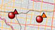
(a) Cone becomes more of a triangle symbol to make it more abstract, less literal. That way variations on the triangle can symbolise “pre-build” status. I think colours can remain, as they provide continuity with the existing icons. So:

  • Blue triangle = permit
  • Orange triangle = construction

Others have suggested another icon for “unconfirmed activity”, suggesting that people keep an eye out at this location. This could be a white triangle (i.e. “blank slate”).

image

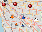
Just an example - I am no graphic designer! A couple of sizes shown. The final version would no doubt be tweaked in several ways to match the style of the dots.

In addition, a lot of sites sit at permit/construction phase for a while. I suggest that after a period of time (6/12 months) these icons become partially transparent, to indicate the data is dated. This could be automatic based on the age (perhaps 6 months = 25% transparency, 12 months = 50% transparency, 18 months = auto-delete or auto-hide).

image

Then we move on to the “active” sites (red dot).

I suggest we don’t need a separate marker type for “limited hours”, this can be specified in the site information.

Activity that does occur, which is worthy of highlighting, is site expansion. This is kinda tricky to display at an already active site, but I’m thinking something like:

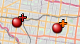
  • site undergoing expansion - red dot (as now) with an orange “plus” symbol in the corner. (orange to match the construction cone colour)
  • site recently completed expansion - red dot with a red “plus” symbol in the corner

As with the “fading” permit/construction markers, the “red plus” symbol would return to normal red dot after a certain period (30-60 days?)

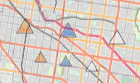
Examples of how the “plus” would look (I’m quite obviously no graphic designer, but just playing about)

image

Maybe with triangles? (to keep consistent with the orange triangle symbols? But a recently expanded site isn’t under construction any more…)

image

Expanded sites could be triggered to appear on the “changes” log.

Finally, the temporarily closed and permanently closed sites could be changed from dots, to something to show they are unavailable (like an X shape).

image

I haven’t really thought about the green “custom” marker, but if this was changed to something else, it leads to another possibility: Only active sites would be marked with dots. This would lead to the possibility of using different colours to mark different attributes (whether this be: speed; stall count; age; whether it is Tesla only or all EVs; or anything else) without confusing things like permit sites, closed sites. Definitely not something I’m proposing now, but it tidies things up, so the discussion to be had in the future.

When I was coming up with the shapes, I didn’t want to make them too complicated, but I also wanted to make it obvious what they represented. If you know orange means construction, and a plus means “more”, the meaning should be clear.

This all sounds like extra work for editors, with so many states to track, but most of these would be automated (so extra work for the coders… sorry :wink: ) - the only new one is the white triangle, whatever it ends up being called… and not many sites would be affected… The expansion changes, we already track, just that we used the free text field.

One challenge with the expansion one - do we want to record past site expansions? So that the “stall count” graph is accurate? I assume this would mean a re-write of the database structure.

Any other comments, observations, thoughts?

2 Likes

I have another idea based on concentric circles.

My idea is that we can convey the size of the station - stall count, different shades for red for urban, v2, v3 and expansions ongoing in a easy visual way. You could see the giant stations of like 80 stalls over the tiny 4 stall ones. (I always wanted the I-5 between LA and san fran to better represented visually as there are only a few locations there but they have massive stall counts so showing the user that there are plenty of charging opportunities here)

Not sure how quick it will be to display them on the site as it will/could involve multiple circles on top of each other and calculating the radius of all these different sizes.

so something like:


(forgive the transparency and the black borderlines, etc only quickly looked online for a concentric circle drawing tool)

So the 3 circles one (all fictious locations) is a big site with a bunch of V2 and V3 (dark & light red), another small V3 site with an expansion under construction (yellow) and a permitted (blue) one to the south.

We don’t have all this information like V2 vs V3 stall counts and expansions under construction in a easily readable form in our database but that is being work on. When that it is complete hopefully something like my ideas could be possible one day.

3 Likes

I like a lot of these ideas!

I feel like limitations on hours and access are important enough to represent as part of the marker itself, from the perspective of planning a trip. Maybe transparency could play that role?

Also from the perspective of planning a trip, it would be helpful to see max power and some indication of a site’s overall size at a glance. While I like @Rovastar’s concentric circle idea in concept, I expect implementation would be problematic (1) because range circles look so similar and (2) because of the clutter we’d get in densely populated areas. The dimensions I think we could play with are color (including transparency), shape, size, and symbols, but each one has its limitations and drawbacks.

  • We’re already using color and shape to denote other statuses, so we have to be careful not to create any confusion over the meaning of a particular color or shape, and we need enough distinction among colors to be meaningful (e.g. subtle shades of red might not be enough)
  • If we vary size too much, we run the risk of re-cluttering the map, and if we vary it too little, people might not notice the difference between marker types
  • Symbols could work well inside or alongside a marker at higher zoom levels, but might be too cluttered or hard to decipher when zoomed out
    • One possibility for symbols would be a I, II, or III inside a dot for urban, V2, and V3, but that might require bigger dots
  • Whatever we choose, I think it would be important to make the legend more easily discoverable directly on the Map page (right now it’s on the About page along with a lot of other info)

I realize I haven’t offered much in the way of concrete proposals here, just figured I’d add a few thoughts.

1 Like

Just a random idea, but how hard would it be to create additional “Open” layers, and put the different power levels on their own layer, that way we could filter out sites by power level? That would reduce the need for additional colors.

I really like the simplified triangles to denote permit/construction, and the white triangle for potential sites.

2 Likes

Thanks for the feedback everyone!

I think that custom symbols, colours, circles, etc. to indicate speed or stall count are something that can be enabled once we aren’t using circles for multiple things (e.g. at the moment: permit, open, custom, closed). But I can see how this wouldn’t work if construction icons were triangles.

Maybe install of the orange plus sign in the corner, the “expansion in progress” sites could have an orange halo around the circle?

Maybe the usual red icon with a while line across the middle? Similar to a “no entry” sign. The symbol should be recognised as an access restriction. But it could be mistaken for a “temporary closure”.

A red circle with a clock style symbol on it? To signify limited times of access.

Of course, the icon doesn’t need to change at all, I’m just thinking of alternate designs.

What about a special symbol for stations that allow Tesla + Other EVs? Red square? Location pin icon that looks like a “downward teardrop”?

Agree, please don’t delete this information, in Poland we have a supercharger that doesn’t work at night, although according to the Tesla website it works 24/7 and it is unknown when they will update this information. Thanks to your website I found this and will now plan my trips differently.

3 Likes

This is already implemented. Look for the little blue car icon:

Screenshot 2023-09-28 at 8.16.00 AM

I think @fhteagle meant a distinct symbol on the map page. I’m still hesitant to make the map more complex than it already is, and it’s possible to use filters for this use case, but perhaps this is something we could eventually build as an “advanced” feature that users could enable in preferences / settings. Not sure we’d want to use the same little blue car icon on the map page though :slight_smile: and of course it gets even more complicated because there’d be 4 permutations of “open”:

  • open 24/7, Tesla only
  • open 24/7, Tesla + other EVs
  • open limited hours, Tesla only
  • open limited hours, Tesla + other EVs

Currently, the first two are plain red dots and the other two are red dots with a clock symbol.